Customize Your Mobile Menu
The mobile menu controls how your website appears on phones and tablets. Use the Mobile Header Builder to customize your navigation, social icons, buttons, and other mobile header elements.
Before You Begin
Kadence uses two separate menus:
- Primary Menu — Displays on desktop.
- Mobile Menu — Displays on phones and tablets.
You can use the same menu for both desktop and mobile, or create a separate mobile menu with its own navigation.
Helpful Tip: If your mobile menu is missing pages or looks different from your desktop menu, it’s usually because a mobile menu hasn’t been assigned yet.
Create or Assign Your Mobile Menu
Step 1: From your WordPress dashboard, go to Appearance → Menus.
Step 2: Create a new menu or select an existing one.
Step 3: Assign the menu to the Mobile Navigation location.
Step 4: Save your changes.
Once your mobile menu has been assigned, you’re ready to customize how it appears on phones and tablets.
Open the Mobile Header Builder
Step 1: From your WordPress dashboard, go to Appearance → Customize → Header.
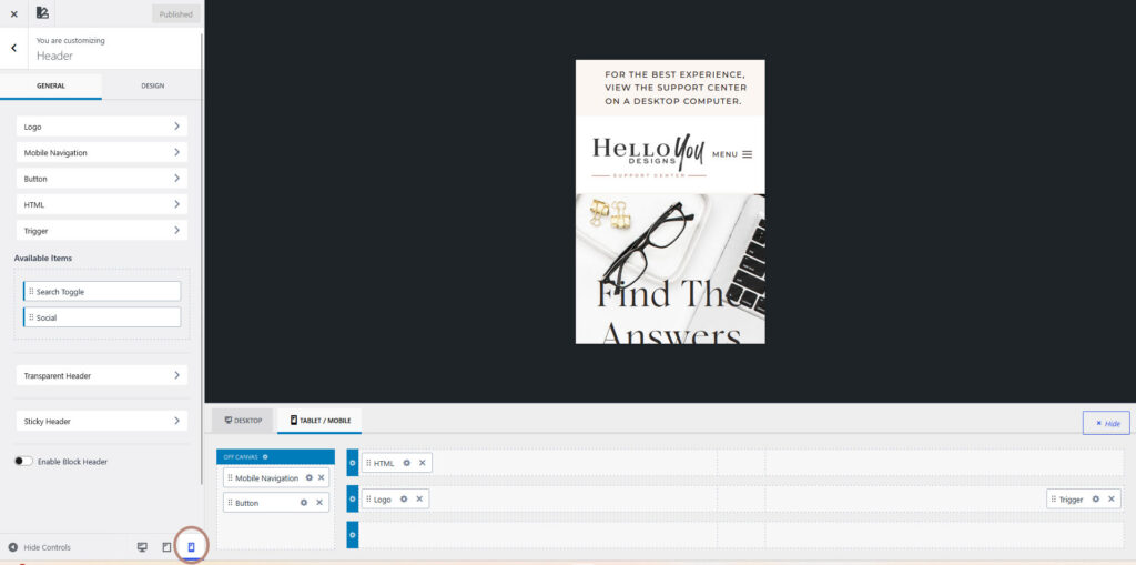
Step 2: Click the Mobile tab to open the Mobile Header Builder.
Preview Your Mobile Menu
Before making changes, switch to the mobile preview so you can see exactly how your menu will appear on smaller screens.
Step 1: Click the Mobile Preview icon at the bottom of the Customizer.
Step 2: Your website preview will update to display the mobile layout.
Customize Your Mobile Header
The Mobile Header Builder allows you to customize every part of your mobile header.
You can:
- Add or remove header elements
- Rearrange items using drag and drop
- Display your navigation menu
- Add social icons
- Display a button
- Customize the Off Canvas menu
Helpful Tip: Not every Hello You Designs theme includes the same mobile header layout. Depending on your theme, you may see different header elements available.
Customize Individual Elements
To edit any item in your mobile header:
Step 1: Click the element you’d like to customize.
Step 2: Use the General and Design tabs to adjust its settings.
Every element includes its own settings, allowing you to customize colors, spacing, typography, visibility, and more.
Rearrange Header Elements
You can also drag and drop elements within the builder to rearrange your mobile header.
Customize the Off Canvas Menu
The Off Canvas menu is the slide-out menu that appears when visitors tap the mobile menu icon.
You can customize:
- Navigation
- Background colors
- Typography
- Social icons
- Buttons
- Additional content
Click the Off Canvas element in the Mobile Header Builder to customize these settings.
Helpful Tip: Changes made to your mobile header only affect the mobile layout. Your desktop header settings remain unchanged.