Theme Documentation
Hello CEO
Your go-to resource for everything about your theme. Find setup guides, customization tips, and answers to common questions.
Theme Overview
Here you will find the basics to run your theme like the demo. We have also included additional details like the fonts, and demo colors.
Plugins
* are required for theme function
Requirements
WordPress 6.3+
PHP 8.2+
Required Plugins x2
Colors
#4C6255
Palette 1
#D8CDCB
Palette 2
#B89076
Palette 10
#222222
Palette 3
#2C2823
Palette 4
#4B423B
Palette 5
#BD6B39
Palette 6
#EEE1D0
Palette 7
#F5EFEC
Palette 8
#ffffff
Palette 9
Fonts



Recommended
Image Guidelines
Upload images that match the aspect ratio of your layout for the best quality, performance, and responsive display.
Common Image Sizes
These are the image ratios you’ll see used throughout the demo.
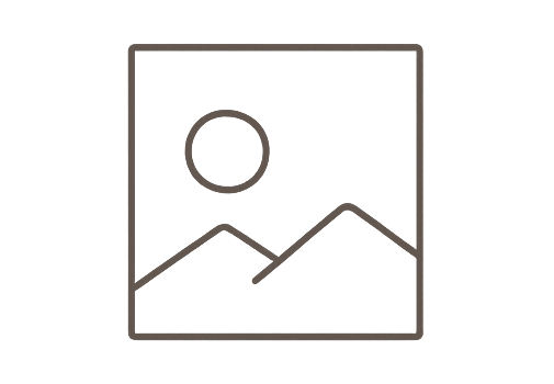
1:1
Square
Perfect for categories, profile photos, & products
Recommended width:
Up to 1200px

16:9
Landscape
Ideal for hero sections, banners, and full-width images.
Recommended width:
Up to 1900px
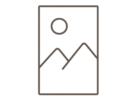
3:4
Portrait
Perfect for featured images, blog posts, and post cards.
Recommended width:
Up to 1200px
Advanced Header Settings
Flexible Header Styles
Hello CEO includes transparent, solid, and sticky header styles. Use the guides on the right to customize each header to match your website.
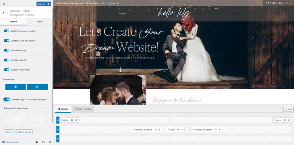
Sometimes after importing the demo, the Transparent Header settings may not match the demo exactly. If this happens, simply update the settings below.
Enabling Disable on Pages and Disable on Posts allows you to choose which individual pages or posts use the transparent header from the page or post settings.
If you prefer the transparent header to be enabled across your entire site by default, you can leave these options disabled and adjust the page spacing settings as needed for your layout.
Go to Appearance → Customize → Header → Transparent Header
Enable Transparent Header.
Enable the following options:

One of the great features of the Kadence framework is the ability to use a separate logo for your Transparent Header. This allows you to display one logo when your navigation has a solid background and a different logo when it appears over a hero image or banner.
For example, you might use a dark logo for your standard header and a white logo for your transparent header.
Because these are two separate logo settings, updating your primary logo will not automatically update the Transparent Header logo (and vice versa). This gives you complete control over how your branding appears in different areas of your site.
Note: The screenshot is for Lily, but it works the same for CEO
Go to Appearance → Customize → Header → Transparent Header
From this screen, you can upload the logo you would like to display when the Transparent Header is active. If you prefer to use the same logo throughout your site, simply disable the Use Different Logo for Transparent Header option.
To update your primary site logo, return to Appearance → Customize → Header and edit the logo in the main Header settings.
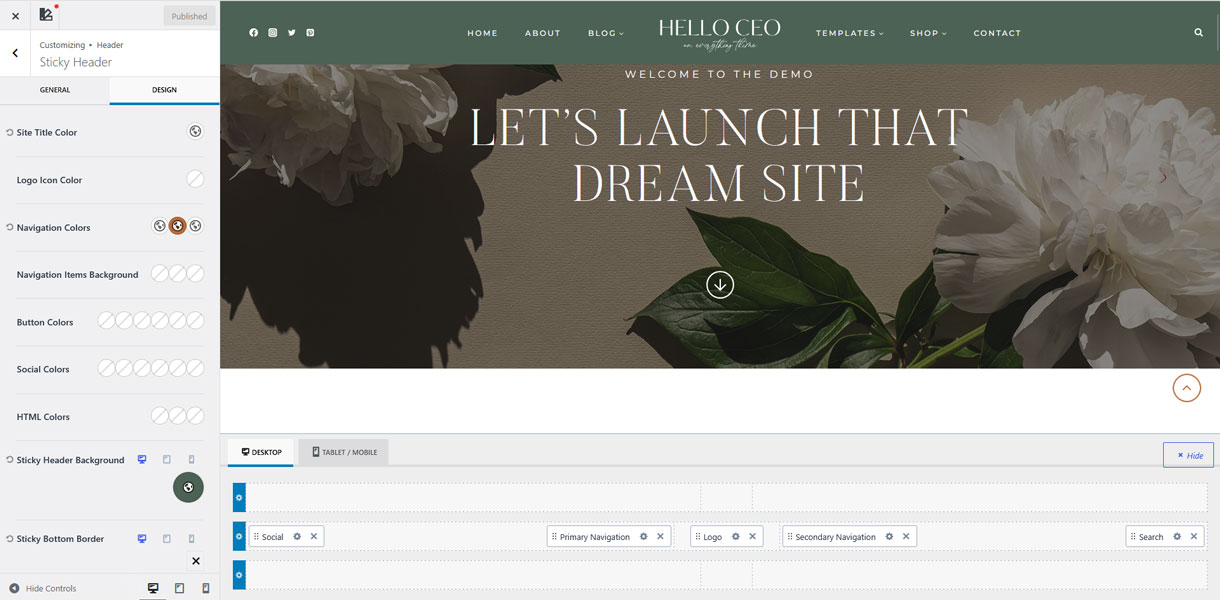
Go to Appearance → Customize → Header → Sticky Header.
Step 1 – Open the Design tab. This is where you can customize the navigation colors and background.
Step 2 – Adjust the navigation colors. The three color options control the Default, Hover, and Active states of your navigation links.
Step 3 – Set the navigation background color. In the demo, we used Palette 1
Note: If you change your Global Palette colors later, the navigation background will not automatically update if you’ve applied transparency. Because the background color has been customized with an opacity value, you’ll need to manually select the new palette color and reapply the desired transparency.
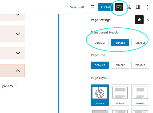
The Transparent Header can be enabled on individual pages and posts, giving you full control over where it appears throughout your website.
Step 1 – Open the page or post you would like to edit.
Step 2 – In the top-right corner of the editor, click the Page Settings icon (the notepad with a pencil).
Step 3 – Under Transparent Header, select Enable.
Important: When using a Transparent Header, the first block on the page should include enough top padding so your content doesn’t sit behind the navigation.
We recommend using 10–12em of top padding for hero sections. If you’re using a section from the Design Library, the recommended top padding has already been applied for you.
CUSTOMIZATION GUIDES
CEO Theme Features
These tutorials cover the unique design options included with Hello CEO. Follow the guides below to customize your headers and other theme-specific features.
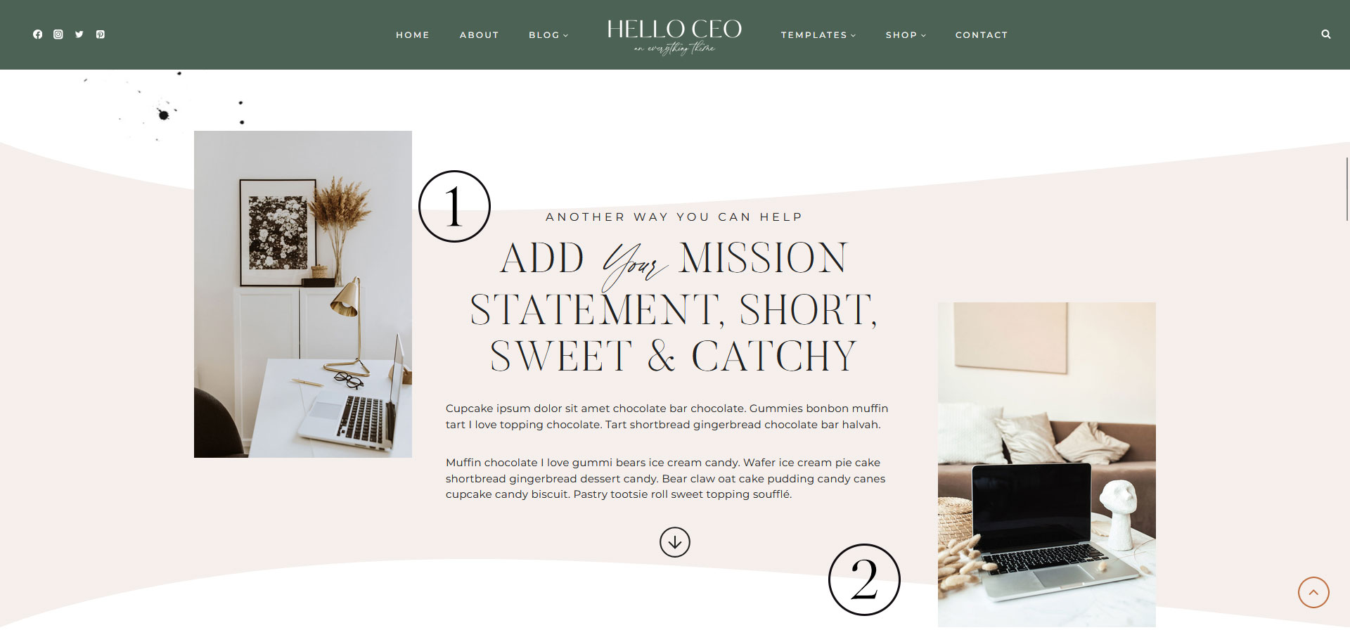
What it does
Let’s you mix in your accent font with a header style.
Example

How to use it
Create your heading. Then select the words you would like to be script and apply the Italic styling to those words only.
To change the color, select the script text and from the menu bar above the text, select the arrow ( ⌵ ), and then highlight. There you can choose an accent color.
What it does
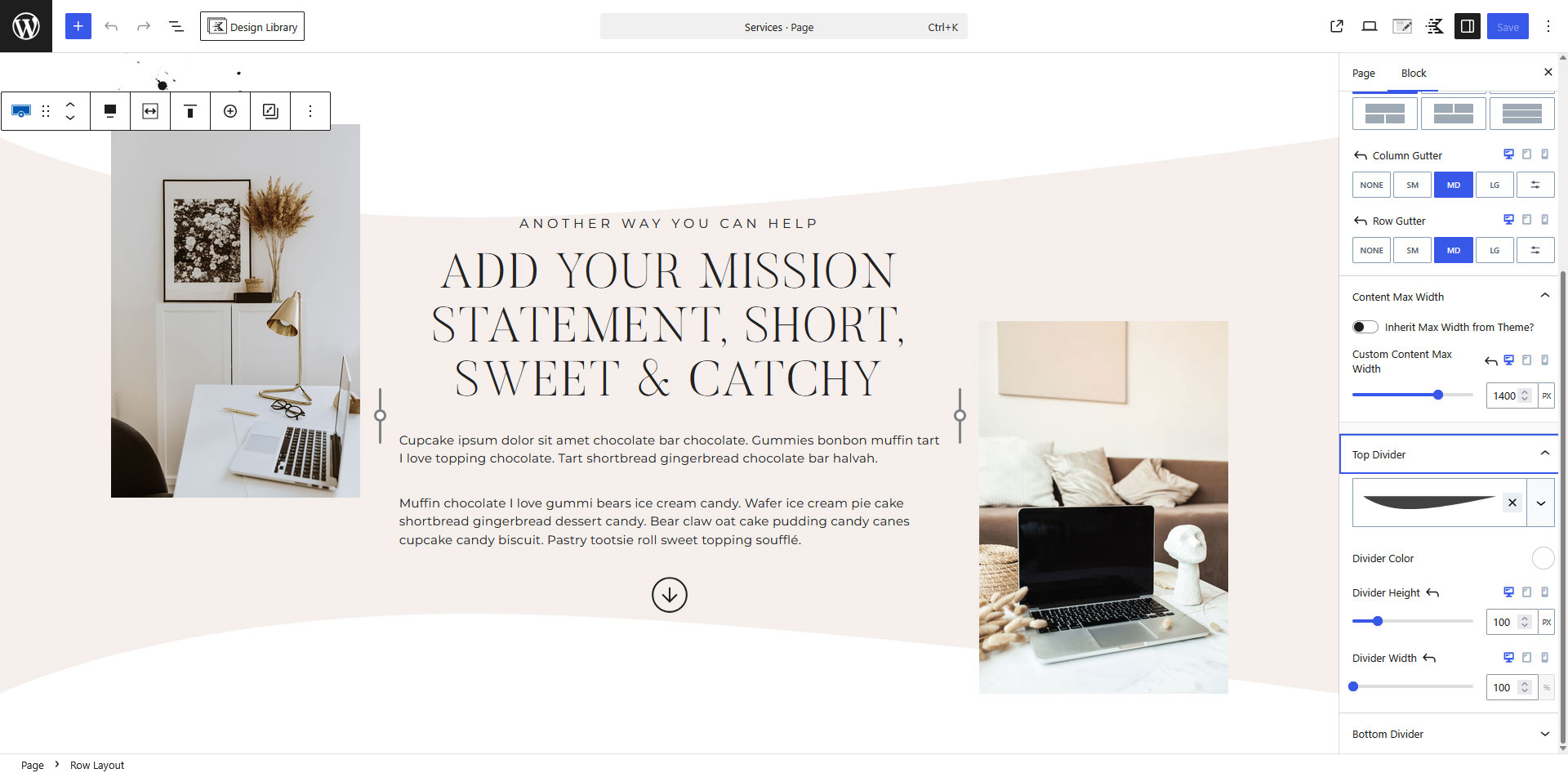
Creates the decorative swoosh dividers used throughout the Hello CEO theme. You can adjust, replace, or remove these dividers at any time.
Example
How to use it
Click the Container that includes the swoosh divider. Make sure you’ve selected the entire container, not a block inside it.
In the editor, open the Style tab and scroll down to Dividers.
Adjust the Top or Bottom divider to a different style, change the height and width to create the look you want, as well as the color.
Click save and view your page.
Quick Tip
If you don’t want a swoosh on a section, simply disable the Top or Bottom divider in the Dividers settings.
VIDEO TUTORIAL
Learn to Use Your Block Library
Learn how to use your Block Library with confidence. This video covers browsing your library, adding blocks to your pages, editing content, moving sections, and customizing layouts to fit your website.
QUICK START
Quick Answers & Tutorials
Find quick answers to the questions we hear most often, or browse step-by-step tutorials for more detailed guidance.
Everything you need to customize
your theme from start to finish.

Popular Tutorials
Step-by-step guides
The most common tutorials our users find helpful.

Popular Questions
Quick Answers
Browse answers to the questions users ask most often.

Still need help?
We’re happy to help! If you couldn’t find the answer you’re looking for, send us a support ticket and we’ll get back to you as soon as possible.
Changelog
Follow the evolution of your theme. Every new feature, improvement, and bug fix will be documented here, so you can quickly see what’s changed.
Found an issue or have an idea for a future release? We’d love to hear from you.