Theme Documentation
Hello Rosewood
Your go-to resource for everything about your theme. Find setup guides, customization tips, and answers to common questions.
Theme Overview
Here you will find the basics to run your theme like the demo. We have also included additional details like the fonts, and demo colors.
Plugins
* are required for theme function
Requirements
WordPress 6.3+
PHP 8.2+
Required Plugins x2
Colors
#B78383
Palette 1
#2B211D
Palette 2
#C8AFB0
Palette 10
#35312F
Palette 3
#746B67
Palette 4
#B9AAA2
Palette 5
#DED1CC
Palette 6
#FAF8F5
Palette 7
#FEFDFC
Palette 8
#F3E7E7
Palette 11
Fonts
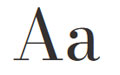
Bodoni Moda
Headings

To The Sea
Accent
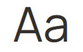
Manrope
Body
Manrope
H5 · H6 · Buttons · Nav

Recommended
Image Guidelines
Upload images that match the aspect ratio of your layout for the best quality, performance, and responsive display.
Common Image Sizes
These are the image ratios you’ll see used throughout the demo.
1:1
Square
Perfect for categories, profile photos, & products
Recommended width:
Up to 1200px
16:9
Landscape
Ideal for hero sections, banners, and full-width images.
Recommended width:
Up to 1900px
3:4
Portrait
Perfect for featured images, blog posts, and post cards.
Recommended width:
Up to 1200px
Custom Code
Built-In Styling Options
Use these optional CSS Classes to add theme specific design details to your layouts. These classes are completely optional and can be used in the Additional CSS Class(es) field for any compatible element in the editor.
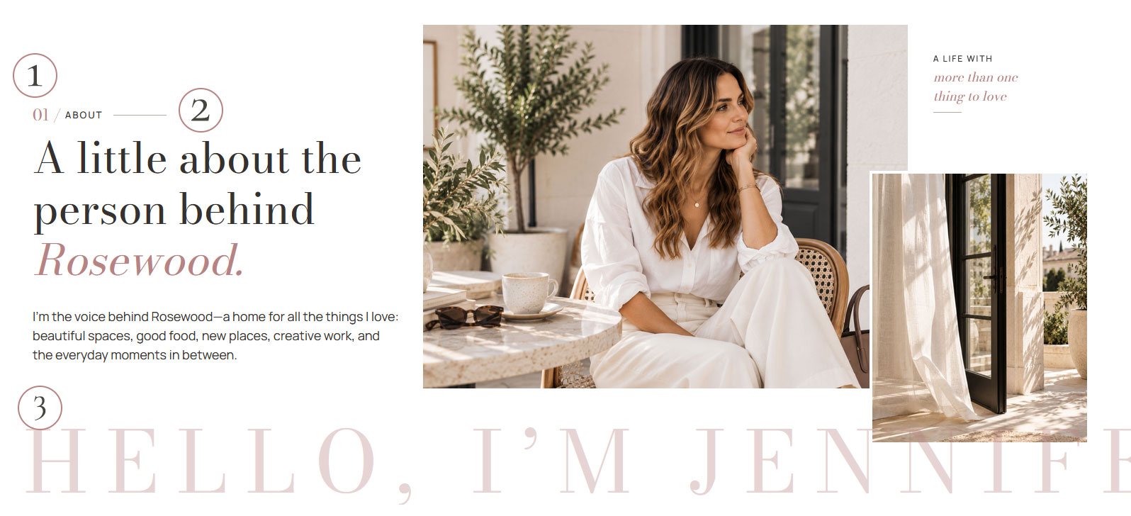
What it does
It combines your heading and body fonts, displaying the body font at 40% of the heading’s size for a unique, mixed-font look.
Example
How to use it
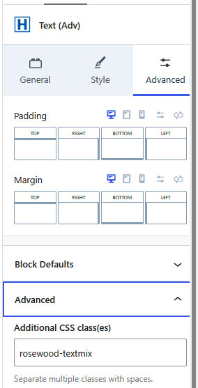
Add a Kadence Advanced Text (Adv) block and enter your wording using your heading font.
Highlight the words you want to display in the accent font and apply Italics.
With the block selected, open the Advanced tab in the right editor sidebar. Expand Advanced and locate the Additional CSS Class(es) field.
Enter rosewood-textmix in the Additional CSS Class(es) field and save your page. The italicized words will automatically display in your body font at 40% of the heading size.
Add an accent color
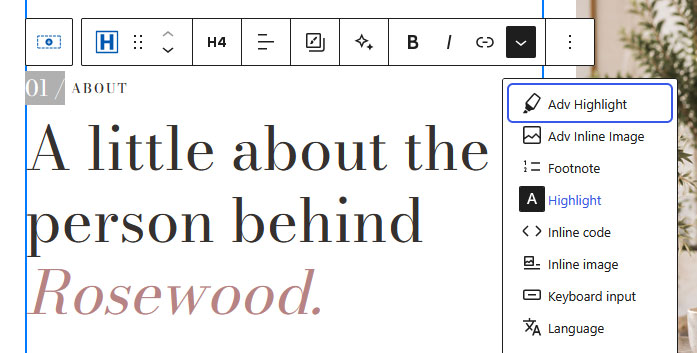
To add an accent color, highlight the words you’d like to customize. In the toolbar above your text, click the dropdown arrow and select Highlight, then choose your desired color.
You can combine accent colors with the mixed-font styling to recreate the editorial headings used throughout the Rosewood demo.
What it does
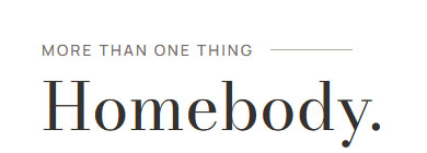
Adds a decorative line after your heading for a subtle, editorial accent. Available in two sizes, regular and small, to complement different heading styles.
Example
How to use it
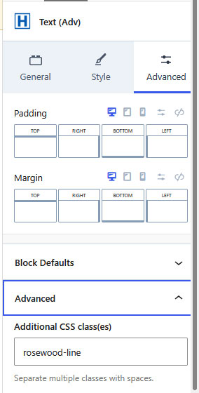
Select the Advanced Text block containing the heading you’d like to add a line accent to.
In the editor to the right, click on Advanced and then the Advanced Tab.
In the Additional CSS Class(es) field, add one of the line classes from the list
Save and preview your page.
CSS Classes
Choose one of the CSS classes below to add a regular or small line accent to your heading. Click to copy.
Regular Line
Small Line
Line color
The line color is controlled by Palette Color 4, making it easy to customize to match your brand.
What it does
Adds a continuous scrolling text effect to your wording, bringing movement and visual interest to your page. The scrolling automatically pauses when a visitor hovers over the text.
Example

How to use it
We recommend adding the Marquee directly from the Design Library rather than building it from scratch. The block includes the layering and styling needed to create a seamless scrolling effect. Keep the existing block structure intact while customizing the text.
Open the Design Library and insert the Marquee block into your page.
Select the text within the marquee and replace it with your own wording.
Customize the text to match your design, including font, size, color, styling, and links.
Save and preview your page to see the scrolling effect in action.
What it does
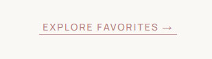
Adds the Custom Rosewood Underline style to outline buttons.
Example
How to use it
When adding a block, select the Buttons (ADV) block type
Under the General Tab, select Outline Button
This will automatically style your button like the image to the left. Add your wording and link.
Styling Help
The arrows are not part of the button. While you can use one of the Kadence icon arrows on the button, I preferred the below style. Click to copy.
VIDEO TUTORIAL
Learn to Use Your Block Library
Learn how to use your Block Library with confidence. This video covers browsing your library, adding blocks to your pages, editing content, moving sections, and customizing layouts to fit your website.
QUICK START
Quick Answers & Tutorials
Find quick answers to the questions we hear most often, or browse step-by-step tutorials for more detailed guidance.
Everything you need to customize
your theme from start to finish.

Popular Tutorials
Step-by-step guides
The most common tutorials our users find helpful.

Popular Questions
Quick Answers
Browse answers to the questions users ask most often.

Still need help?
We’re happy to help! If you couldn’t find the answer you’re looking for, send us a support ticket and we’ll get back to you as soon as possible.
Changelog
Follow the evolution of your theme. Every new feature, improvement, and bug fix will be documented here, so you can quickly see what’s changed.
Found an issue or have an idea for a future release? We’d love to hear from you.